Tuesday, 1 April 2014

Radio Trailer

This is the final film trailer for our film.

We used snippets of the film itself, using sounds and dialogue, as well as creating new voiceovers to explain a brief storyline of our film to listeners.


Evaluation 4


4  How did you use new media technologies in the construction and research, planning and evaluation stages? (ESSAY/VIDEO/MIND MAP?)

Internet use:Before we could start filming it was vital that we looked into all the things we needed in order to make our film as realistic and well thought out as possible and to do this it was important that we used all the correct resources, I used the different aspects of Google a lot, as the search engine is the most responsive and gives all the best results. I used Google search to look for Audience research, Genre research, Age certification research. I also used the Google Images, this is also a useful use of technology, as I used it to look for images of prop ideas, makeup, costume, and ideas of location. It was also highly useful in terms of finding pictures of the shot types we needed to put into our film to make it realistic. I also used another aspect of Google which was Google Maps, I used this to look for a suitable location for my group to film certain scenes, around the areas that were easily accessible and safe, that also didn't contain much exterior traffic noise and unwanted non diegetic sounds. We used Google Blogger to maintain all of our research as it is like an online diary of what we have done all along
 throughout the process of making the film.


Celtex:
We used Celltex on the Apple IMacs, Celltex is the forum in which we created and based our official and final scripts on, We used the facilities on it to create a well based and thought out.


YouTube:
YouTube has also been a strong contentment when creating our film, as we have used YouTube to look at similar types of films, title sequences, similar short stories, radio trailers and also to base the final film on. After we finished our film we had to base the link onto a you tube account and our video is then accessible online.


                                              Cameras and Video camera:
After using the aspects to plan and prepare to make our film we then had to gather our resources in order to film the five minute film. We used a normal camera in order to film a practice film of our group taking a trip from the ground floor In the old mill lane building up to the fourth floor, via the lift and some stair case, we used this to help us prepare for the use of a more advanced video camera and get us ready to practice editing etc. However after this we then developed an understanding on how to use these cameras and began to film for our official film. We began using the cameras by using simple shots such as: Close up, extreme close up, long shot, extreme long shot, medium close up, medium shot etc. We then began to adapt to the uses of the more advanced shots such as: Rabbit in the headlights shot, Over exposed shots and a fade out when Jared disappears in the ending of the film.


Final cut express:
Final cut express was the application in which we edited our final film on, we added different scenes of our film on to it. We placed in the different scenes on to the timeline we created watched them back and cut different parts out that we didn't need or want in our film and got rid of all bloopers and unwanted scenes. We also managed to make sure all our shots had match on action and was perfectly linked. On Final cut, we also managed to add it any extra SPX and effects we wanted to make a reaction, For example final cut made the best possible result of our drugs scene, where Carrie consumes Drugs and is in a daze, by using this application we managed to add blur, a high contrast and flashbacks and at the final scene where Carrie realizes Jared was never there to start with,
                                                          and we have Carrie on the screen, and in the blurred background 
                                                                       the previous events throughout the film.

Screen Shotting:
I used screen Shotting quite often for screen Shotting scenes of films on YouTube, I found this the most successful form of copying as it shows the video on YouTube as well as what was typed it etc.

Prezi:
I used Prezi throughout the process of writing my evaluation, As we had to write our evaluation in using three different methods, Prezi was one of the methods that I chose to use for my conclusion. I found Prezi easy to use and I liked the layouts that's were available. On this I prepared my evaluation question two, and I was a simple and easy outcome. 


Microsoft documents: PowerPoint & Word:
I used Microsoft documents in order to complete two parts of my evaluation. I used PowerPoint and Word documents. I used them as they are easily accessible, simple to use and can show my evaluation in a good, strong and well focused manner. I used powerpoint in order to then place on to slide share so it can go on my blogger account.


Slide share:
I used slide share in order to place my PowerPoint presentation evaluation onto blogger, it is simple to use and I learnt to use it last year in AS media studies.


We looked at the different website provided in order to discover some appropriate music for the genre of our film, in the end we couldn't find any music that jumped out to us in a specific way in which would create the effect we wanted in our film. However,  we received some music from someone in our groups friends who has their own band, We thought this was a good idea therefore we weren't committing copyright and we had permission to use the music given by Jake Wood hams. The music was perfect for our genre and the website was easy to use.  


 Another music site we looked at was Jamendo, we looked at this site for sound effects, as in our film we had things like car crashes, so we needed a skidding effect. We looked through several and in the end found the perfect sound. We used it twice in our film, one for the car crash and one prior to the crash to foreshadow what was about to occur.

Evaluation 3

Evaluation Question 2

Friday, 21 March 2014

Evaluation Question 4

I have presented Evaluation Question 4;
How did you use new media technologies in the construction and research, planning and evaluation stage?

as a Prezi, shown below.


Friday, 14 March 2014

Film Poster Idea

For the film poster, I wanted to make sure that it involved the people in our film, and that it was understandable, so that once the audience had seen it they would have a rough idea of what the film is about. After trying out a few different images with Carrie and Jared together, I decided this would be the best image to use; I thought this image of the two together would be the best option as it shows the different sides of personality between them, with Carrie smiling, as if she is happy to be in Jared's arms, and then there is Jared, looking into the distance with a sullen look on his face, as if there is some something underneath the happiness. 

 
After deciding on the image, I had to make sure it was poster-sized, as this is one of the requirements. I also wanted to change the picture slightly, as the original has very bland colors and comes across as dull. So to change this I went to the 'change lighting' section in Photoshop and made all of the highlights a little brighter, and then made the contrast as high as I felt relevant, so that it made Carrie's face quite bright, showing that in this dark story she could be all innocent and angelic, and Jared's face slightly darker, showing that there might be something going on in between the couple.
 
 
 After the touches were made on the image, it was time to add text. I already knew the font I was going to use so that was a simple decision, as I thought because the font we have used for the title in our film have worked so well we may as well keep it the same, so for the font we used 'Cambria'. I also thought the color would be okay to keep the same too, because the background is quite dark on the image and the text is so bold it stands out well in white.

 
 However, to make the text stand out a little more, I copied the layer that involved the title text, turned the text color from white to black, and put it behind the original text, but slightly below and to the side. This gave the effect of a drop shadow giving me the freedom to move it as I wish, and I think this made the font stand out even more above the background.

 
 Another trick I learnt from the short time I used Photoshop was the ability to make the text I had added to appear as though it was in front of the background in the image, but behind Carrie and Jared. For this I just added the text onto the image so that it was in front of everything, and then used the 'Eraser Tool' to rub out any sections of text that were covering the two faces in the image. This is shown in the two images below close up.


I then wanted to add a sort of tag line to the poster, giving the audience another idea of what the film is about. The tag line I decided on was 'DAZED BY LOVE. DAZED BY DEATH.' I thought this would add some allure to the film, as it gives the impression that there could be death involved with the film, but it makes the audience want to see the film to see what it means.


Another requirement for the poster is the credits, and this is the only change in font that happened on the poster, as the credits at the bottom have to be in the font 'Steel Tongs'. The credits include things such as the director, who stars in the film and who the music is by. It also includes the name of the production company and the distribution company used.
  
 
 The next step I thought would be to ass some reviews to the top of the poster, showing that there is some sort of accreditation to our film. this is again in the same font as the rest of the main text.
 

The final step in creating my poster for our film was to add any symbols that might have been needed to give information to the audience. The first I added was the BBFC registered 15 age rating, as that is needed to make people aware that anyone under 15 would not be able to watch this film. I also added the logos for the production company (which is the logo I created before hand) and the logo for the distribution company (something I decided on in a different blog post).
 
This is the final Result.


Tuesday, 18 February 2014

Film poster Idea

As my groups film is a psychological drama, it is important that the colours, pictures and text are related to the poster as much as possible as this is responsible for a small section of the advertisement process of  'Dazed'.

My idea is to use dark colours such as: Grey, Black, Blue etc,. I have chosen to use these kind of colours due to the dark mysterious background of the story, as it is a psychological drama, about a girl with an illness, which causes her to imagine things that aren't real, throughout this process she begins a heavy drug addict and alcohol consumer. As eyes play a crucial part in the acknowledgement of a drug addict, My idea was to have all gloomy colours in the background of the poster and  a pair of eyes, with bags round them, tired looking with large pupils to create the drugged effect. However, the eyes will be Bright blue, and all the other colours in the back ground dark. The skin being grey and worn, and the eyes being the only things that stand out and eye-catching. As our film storyline is fairly confusing the picture of just the eyes will create an addition to the mystery and confusion behind the eyes. In the background could be clouds, fog etc anything that adds slight confusion or partial dimness, as the Carrey the girl in the film, lives her life in pure denial and confusion of her illness, this will put the target audience into the shoes of Carrey through the method of a poster.

This is just an example, but the eyes on the picture will look tired, and have sever bags under them, to create the drugs abuse effect on her eyes, It would be good if the picture we use of Rebeccas eyes, (Plays Carrey) to have over sized pupils as well.
 The types of colours that I believe will look the best are colours that are Grey, Black, White etc, I think although they are quite bland and plain colours behind a strong colour like Blue that i will be using as a colour of some eyes, will contrast well.
I like the clouds in this picture, and I think clouds look quite mysterious and creepy when they use colours like grey and white. This sort of back ground will look good in the background of the eyes.  The Masthead we will use, will be 'DAZED' in big letters, the font I think should be sharp and eye-catching but it cant out-shadow the eye picture.  I think the title should be placed under the eyes, along where the nose would be originally, or where the mouth will be.

Tuesday, 4 February 2014

Radio Trailer Research

Conventions of a Radio Trailer:

  • Voice over with sounds and effects from the film etc
  • Information at the end of the trailer including things like Age certificate & Viewing
  • The films slogan
  • The main focus is to encourage your target audience to watch the film

  • Voice over: We think that using a voice over on our radio trailer will encourage our targeted audience to watch our film, it will also tell the listeners where the film will be taking place and where you can view it 
  • We will include clips and scenes from our short film, in order to give the audience an insight of the storyline and activity that takes place
  • Also we could include a sound shot from the film we have created demonstrating the types of music and sound effects we have used.


Tuesday, 28 January 2014

Film Company Logo Idea

To start with i wanted something that would be film related, as it was for our film company and would be fitting as an image to go with our name. Here are a few of the images i looked at.

                     
 Each one has a different style, and wanted to make sure the individual shots of the film reel were very visible so that i could add text to them later on. Out of the 4 i looked at, i liked the second image the most, as i thought it looked old style (as a film reel should) and there is plenty of room for the lettering afterwards.


So the image i chose was this;


I then decided that i wanted to add the same style image within each square to the film reel countdown used a lot in films. I managed to find a decent image but it had a number 7 in the middle, so i had to delete the 7 and make it look like the image never had the 7 there. This is what the end result looked like of one square.


After this one went as i wanted it to, i copied and pasted it onto the other squares of the film reel...

When i added these images to the top and bottom square it got rid of the faced effect at each side, so i used the painting tool to create the effect over the top of the image.

The next thing i had to think about was the font of the logo. I know that i wanted to be the name of our film company to be 'E.B.A.C Productions', but i didn't really know what kind of font i wanted. Then i thought to keep with the old fashioned film style i could take the font most commonly used for the countdown scene in B&W films.

At first i thought the font would look like this.

To find this i went onto Youtube to find the countdown shot, pause the shot and try to match up the font with one on Photoshop.


And this became the end result of my film company loge :)


Tuesday, 7 January 2014

Thursday, 2 January 2014

Analysis of Short Film

I have decided to analyse the short film Awake. Awake is about a Teen, aged around 18, who wakes up one morning and everyone on earth has disappeared, and the rest of film bases itself around his turmoil as he lives out his life on earth completely alone.
I decided to use this film as i thought it could be related to ours very well, as the is a very clever twist at the end which makes every that happens within the film to make sense, and that is something we want to try and do in our film.

This is a very simple layout for a title sequence; or rather a title, as there are no other title sequence parts in the story.
The title 'Awake' gives a clue into the film and already makes audiences interested.

The first shot seen is one of a boy, probably about 18/19, or more specific the eye of a boy. This tells me straight away that this boy will be the main character of the film.
After watching just the first few minutes of this film, it is clear that it based around one person, and the whole thing is voice-overed, which is a good techinque as it helps the audience focus on the expression of the main character.
There is then an establishing shot that expresses what the voice over is saying, as it shows an empty street, clearly showing that this character will be the the ONLY character in the film.
There is then a medium shot showing the boy in full this time, peeking through the blinds of his bedroom. This can sometimes have connotations that there is something hidden, or the character is being veiled by something or there is something being hidden from the character that he is trying to find.
There is then an insert shot of the floor, covered in what look to be mucky clothes. This would be typical of a teenage boys room, so this does not seem unusual except that 'Everyone has disappeared', so the clothes have piled up as there is no one to clean up after him.
The main character then picks up one of the items of clothing, and smells it, clearly making sure that the shirt is clean for him to wear.
The boy then pulls a face what i can only describe as approval. I feel like this was put in for comedic effect, but as he could be the only person left on earth it seems a little out of place.
After getting changed, it goes through the boys daily routine, still with the voice-over of i assume is the boys voice. This shot is of chocolate on spread, which also seems strange as it is quite a childish breakfast to have, for a boy that could be the last person on earth.

There is then an over the shoulder shot of the character looking at a sink full of dirty dishes, which again adds up to the fact that there is no one there to clean them up.
The boy's voice over then speaks about his grandpa, and how he was really ill and he never knew what happened to him, and this is when the mystery starts to increasingly build up.
The next shot then shows the boys expression on the subject, which is sullen and sad.
There is then another establishing shot, showing the house that the boy lives in on his own at the moment, which used to house his whole family. The plain front of the house also adds to the fact that he is alone and lonely.

This is another longer has to that shows the area the boy lives in, which seems full with the cars surrounding the road. However, when you listen to the boys voice over as well, it makes the street seem empty and sad.
This shot is fairly close up, showing the feet of the boy, who seems to be walking slowly, as he obviously doesn't have anything to walk faster for.
This shot shows a small garden gnome, giving the impression that the boy is now no longer alone, and this object makes this boy a little less lonely.
This is a close up shot of the boys expression when he finds the gnome, which I think adds to the idea of this boy being content that he has a found a friend to keep him company in this empty world.
This next shot shows the boy walking along a very empty beach with the new friend, and seems to be walking quicker which shows the change of mood since finding his new small friend.
The voice over is important for this shot, as he is explaining that he attempted to drive a car, just to see if they worked. This shows he is trying to get on with his life even though he is the only one left.
This is an insert shot of what happens when the boy opens the car door. Water rushes from the car, which is really strange and will seem very odd to the audience.
This is an establishing shot of a wasteland, showing what the earth is coming to now that there isn't any people here.
This shot shows the boy with his only friend in the world, giving the impression to the audience of his emptiness inside now that he takes comfort from a garden gnome.
This next shot shows the boy sleeping in the wasteland shown before, obviously portraying that he has absolutely no fear anymore now that he knows he is alone.
This is a comedic shot of the gnome doing the same thing, adding to the impression of them now being friends.
This shows the boy now fed up of exploring and trying to find something to cure the boredom he has now that he has no human contact.


Another instance of the boy trying to cure his boredom. I've noticed that the boys name is never mentions, obviously meaning that the even though he is the only character he isn't the most important issue of the short film.


This is a very significant shot in the film, because the boy is playing with a toy car, and he puts this car into a fish bowl. It doesn't make sense to start with, but once you have watched the whole film, there are lots of little significant shots like this that all build up to the ultimate twist in the story at the end.

This is when the story starts to turn. This is where the dialogue is the important part, as he explains he keeps thinking that someone is following him. Again, this is one of the significant things that will make sense at the end.

From an audiences point of view, it looks as though paranoia is setting in with this boy and that he is starting to go crazy from being alone for so long.
This shot is nice, as it shows a shadow, which gives the audience the impression that someone is definitely with him on this empty planet.
This is the final scene. The boy gets home and he hears noises, and the whole film seems to be coming to a conclusion at this point.


The expression of his face gives the impression tot he audience that something has shocked him. A lot. And after being alone for so long it would be something big.
This is the most significant shot of the film, showing his granddad has turned up in this world of his, the same granddad that was ill before and he didn't know what had happened. This cuts straight to...
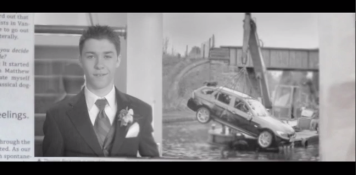
...This. This is the shot that is the explanation of the whole film, and is my favorite part of this film. There are no dialogue, just an image of a newspaper article, and this shows that the boy that had been wondering alone for months was actually the one that died, meaning that this world he had created on his own was his death.
This kind of ending means that it is open to the audiences interpretation, but i took from it was that there were these small clues that all linked together that brought the film to a heavy conclusion; that the boy had been sent into this 'world' when he had died in the car accident, and the only reason his granddad had joined him was because his illness had took his life also.

I like this film because i love the twist fo the story that turns the feel of the film on its head completely, and i would like to create that kind of feeling in our short film.